First edition of redesigned RE Magazine Cover art. April 2021 issue
2022 Hermes Gold Award Winner

Cover concept and illustration for RE Magazine's Voting issue.
Member Controlled. This is a valuable aspect of the electric cooperative world.
By using black and white photography, along with toned color shapes and a broad color background, I kept this concept simple and bold.
Created with Adobe Illustrator an Adobe Photoshop.

Cover concept an illustration for RE Magazine touting NRECA;s International reach.
For this cover, I created a kind of infographic using a world map made up of pale dots. The White dots within the United States represent States with co-ops involved internationally. Yellow dots locate countries outside of the U.S. where NRECA has a notable presence.
Created with Adobe Illustrator.

Cover concept an illustration for RE Magazine's Cybersecurity issue.
For this cover, I wanted to use the iconic lock symbol to immediately set the security tone, but i took it a little further by adding the menacing hooded figure to convey that 'they' are out there lurking.
Created with Adobe Illustrator.

Cover concept and illustration for RE Magazine's Distributed Generation issue.
This cover concept plays on the many choices consumers are surrounded with when it comes to energy choices. I felt that the 'mobile' concept added a little bit of fun to a rather dry subject.
Created with Adobe Illustrator.

Photo illustration for the cover of RE Magazine's Trends issue depicting a conceptual electrical meter.(Special thanks to Jerry Mosemak at https://www.behance.net/jmosemak for the icon assist)
Created with Adobe Illustrator and Adobe Photoshop.

VERSION I Cover concept and illustration for RE Magazine's Safety issue.
This cover concept is meant to convey a sense of danger with literal 'near misses' of the arrows.
Created with Adobe Illustrator.

Cover design an illustration for RE Magazine's 75th Birthday issue.
This cover features classic Black and white photography reflecting NRECA's first 75 years in a collage that makes up the 75 design. The multiplied color screens fall within the NRECA color palette.
Created with Adobe Illustrator and Adobe Photoshop.

Photo illustration depicting a coal plant on U.S. currency. This was a challenging illustration to pull off but It turned out great.
Created with Adobe Illustrator

Hermes Creative Award Honorable Mention
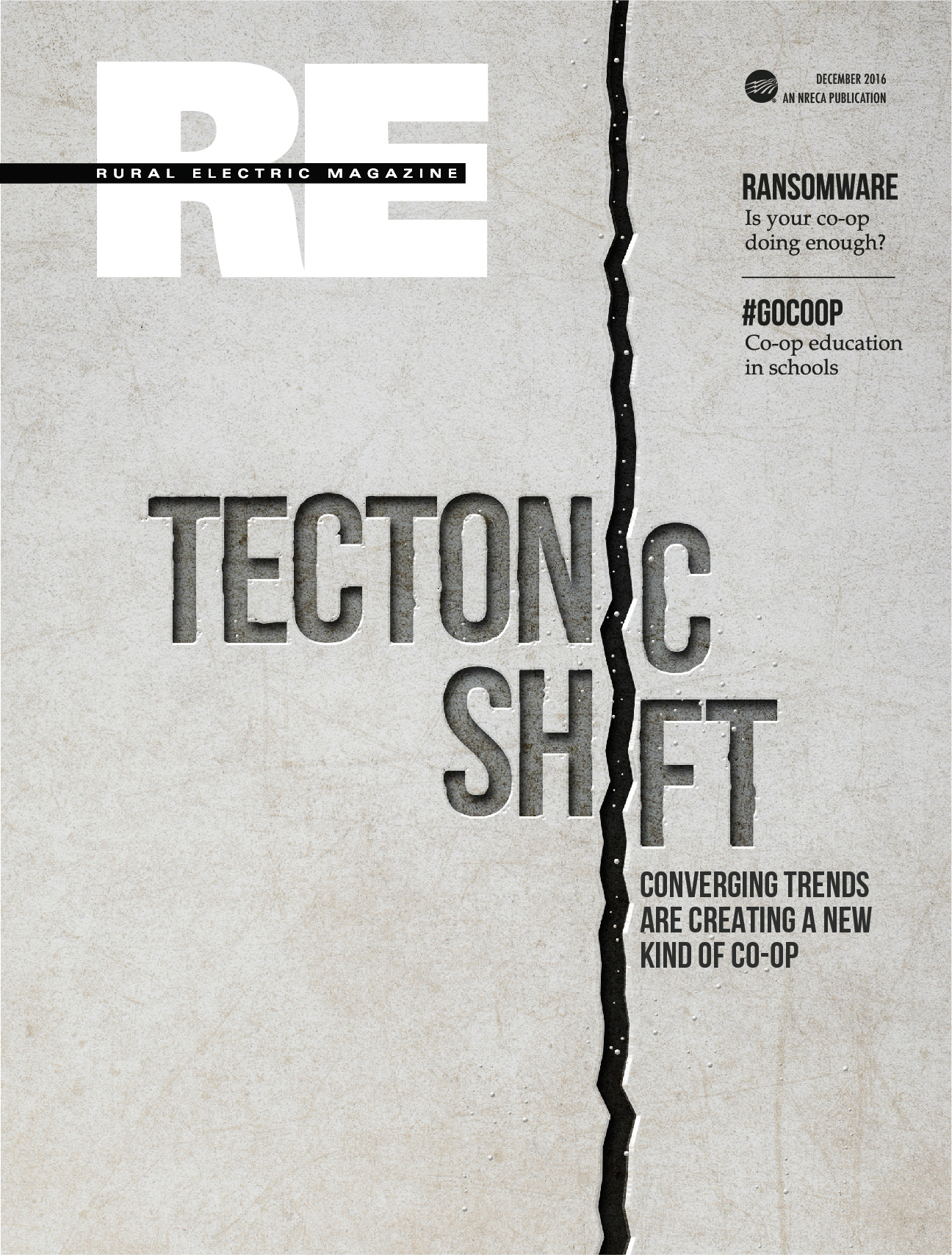
Cover concept and illustration for RE Magazine's Trends issue.
The editorial theme here is that new technologies and shaking the energy industry to its foundations. This concept takes that theme literally by chiseling it into cracking stone.
This was an absolute blast to work on from start to finish. all the 'stonework' was done in adobe Photoshop.
I think it is really effective.
The theme was carried throughout the entire inside spread as you will see in other posts on this site.
Created with Adobe Illustrator and Adobe Photoshop.

Hermes Creative Award Honorable Mention
Inside spread connected to the December 2016 "Tectonic Shift" cover.
Artwork created with Adobe Illustrator and Adobe Photoshop. Layout in Adobe InDesign

Hermes Creative Award Honorable Mention
Inside spread connected to the December 2016 "Tectonic Shift" cover.
Artwork created with Adobe Illustrator and Adobe Photoshop. Layout in Adobe InDesign

Hermes Creative Award Honorable Mention
Inside spread connected to the December 2016 "Tectonic Shift" cover.
Artwork created with Adobe Illustrator and Adobe Photoshop. Layout in Adobe InDesign

This was a fun cover concept.
I wanted to go all the way with the chalkboard theme, so I took the liberty of treating the logo in the spirit of the concept.
Created with Adobe illustrator and Adobe Photoshop.


VERSION II Cover concept and illustration for RE Magazine's Safety issue.
This cover concept plays of the 'safety sign' and conveys more of a warning than an actual sense of danger.
Created with Adobe Illustrator and Adobe Photoshop.

Cover concept and illustration for RE Magazine's Service issue.
Playing on the service theme, this cover illustration uses a 'waiter with gold tray' concept to show the cooperative . I used the icons as a nod to a covered dish.
Created with Adobe Illustrator.

Concept Illustration for RE Magazine story on Big Forest Data

I'm a fan of integrating illustrations into headlines. I was particularly please with this one.
Created with Adobe Illustrator

Platinum Hermes Design Award winning design. This was a 20 page insert for a magazine addressing Cybersecurity.
Created with Adobe illustrator

USA Weekend Summer Special cover
Created with Adobe Illustrator and Adobe Photoshop.

Holiday party special!
I wanted to make this look like a retro gold-flocked party invitation. I was happy with the outcome.
Created with Adobe Illustrator and Adobe Photoshop.

More Flocking fun!
The concept here was to have our cover couple festively flock the window and write on it. This was a challenging technique to master, but really fun to work on!
Created with Adobe Illustrator and Adobe Photoshop.

Cookies
This cover, like most of the Weekend covers I worked on, had a lighthearted spin to it. The idea: put everything on a cookie. The execution was fun and effective.
Created with Adobe Illustrator and Adobe Photoshop.

Thanksgiving games.
The cover concept is an illustration of the headline "A New Spin on Thanksgiving" mixing the food and games metaphors.
Created with Adobe Illustrator and Adobe Photoshop.

This is the End....
Alas, this was the unannounced, last-ever cover for the great USA Weekend Magazine.
Content-wise, I took advantage of the headline (What's hot...) and illustrated the burned page, fire and smoke, but I wanted to send this worthy publication off in style so I placed a clue n the layout. The opportunity was too good to pass up. Only three people knew about it when it was published. Let me know if you see it...
Created with Adobe Illustrator and Adobe Photoshop.


First edition of redesigned RE Magazine Cover art. April 2021 issue
2022 Hermes Gold Award Winner
Cover concept and illustration for RE Magazine's Voting issue.
Member Controlled. This is a valuable aspect of the electric cooperative world.
By using black and white photography, along with toned color shapes and a broad color background, I kept this concept simple and bold.
Created with Adobe Illustrator an Adobe Photoshop.
Cover concept an illustration for RE Magazine touting NRECA;s International reach.
For this cover, I created a kind of infographic using a world map made up of pale dots. The White dots within the United States represent States with co-ops involved internationally. Yellow dots locate countries outside of the U.S. where NRECA has a notable presence.
Created with Adobe Illustrator.
Cover concept an illustration for RE Magazine's Cybersecurity issue.
For this cover, I wanted to use the iconic lock symbol to immediately set the security tone, but i took it a little further by adding the menacing hooded figure to convey that 'they' are out there lurking.
Created with Adobe Illustrator.
Cover concept and illustration for RE Magazine's Distributed Generation issue.
This cover concept plays on the many choices consumers are surrounded with when it comes to energy choices. I felt that the 'mobile' concept added a little bit of fun to a rather dry subject.
Created with Adobe Illustrator.
Photo illustration for the cover of RE Magazine's Trends issue depicting a conceptual electrical meter.(Special thanks to Jerry Mosemak at https://www.behance.net/jmosemak for the icon assist)
Created with Adobe Illustrator and Adobe Photoshop.
VERSION I Cover concept and illustration for RE Magazine's Safety issue.
This cover concept is meant to convey a sense of danger with literal 'near misses' of the arrows.
Created with Adobe Illustrator.
Cover design an illustration for RE Magazine's 75th Birthday issue.
This cover features classic Black and white photography reflecting NRECA's first 75 years in a collage that makes up the 75 design. The multiplied color screens fall within the NRECA color palette.
Created with Adobe Illustrator and Adobe Photoshop.
Photo illustration depicting a coal plant on U.S. currency. This was a challenging illustration to pull off but It turned out great.
Created with Adobe Illustrator
Hermes Creative Award Honorable Mention
Cover concept and illustration for RE Magazine's Trends issue.
The editorial theme here is that new technologies and shaking the energy industry to its foundations. This concept takes that theme literally by chiseling it into cracking stone.
This was an absolute blast to work on from start to finish. all the 'stonework' was done in adobe Photoshop.
I think it is really effective.
The theme was carried throughout the entire inside spread as you will see in other posts on this site.
Created with Adobe Illustrator and Adobe Photoshop.
Hermes Creative Award Honorable Mention
Inside spread connected to the December 2016 "Tectonic Shift" cover.
Artwork created with Adobe Illustrator and Adobe Photoshop. Layout in Adobe InDesign
Hermes Creative Award Honorable Mention
Inside spread connected to the December 2016 "Tectonic Shift" cover.
Artwork created with Adobe Illustrator and Adobe Photoshop. Layout in Adobe InDesign
Hermes Creative Award Honorable Mention
Inside spread connected to the December 2016 "Tectonic Shift" cover.
Artwork created with Adobe Illustrator and Adobe Photoshop. Layout in Adobe InDesign
This was a fun cover concept.
I wanted to go all the way with the chalkboard theme, so I took the liberty of treating the logo in the spirit of the concept.
Created with Adobe illustrator and Adobe Photoshop.
VERSION II Cover concept and illustration for RE Magazine's Safety issue.
This cover concept plays of the 'safety sign' and conveys more of a warning than an actual sense of danger.
Created with Adobe Illustrator and Adobe Photoshop.
Cover concept and illustration for RE Magazine's Service issue.
Playing on the service theme, this cover illustration uses a 'waiter with gold tray' concept to show the cooperative . I used the icons as a nod to a covered dish.
Created with Adobe Illustrator.
Concept Illustration for RE Magazine story on Big Forest Data
I'm a fan of integrating illustrations into headlines. I was particularly please with this one.
Created with Adobe Illustrator
Platinum Hermes Design Award winning design. This was a 20 page insert for a magazine addressing Cybersecurity.
Created with Adobe illustrator
USA Weekend Summer Special cover
Created with Adobe Illustrator and Adobe Photoshop.
Holiday party special!
I wanted to make this look like a retro gold-flocked party invitation. I was happy with the outcome.
Created with Adobe Illustrator and Adobe Photoshop.
More Flocking fun!
The concept here was to have our cover couple festively flock the window and write on it. This was a challenging technique to master, but really fun to work on!
Created with Adobe Illustrator and Adobe Photoshop.
Cookies
This cover, like most of the Weekend covers I worked on, had a lighthearted spin to it. The idea: put everything on a cookie. The execution was fun and effective.
Created with Adobe Illustrator and Adobe Photoshop.
Thanksgiving games.
The cover concept is an illustration of the headline "A New Spin on Thanksgiving" mixing the food and games metaphors.
Created with Adobe Illustrator and Adobe Photoshop.
This is the End....
Alas, this was the unannounced, last-ever cover for the great USA Weekend Magazine.
Content-wise, I took advantage of the headline (What's hot...) and illustrated the burned page, fire and smoke, but I wanted to send this worthy publication off in style so I placed a clue n the layout. The opportunity was too good to pass up. Only three people knew about it when it was published. Let me know if you see it...
Created with Adobe Illustrator and Adobe Photoshop.